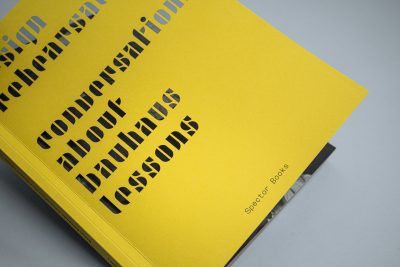
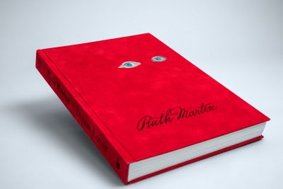
conversations about bauhaus lessons
Spector BooksLess is more!
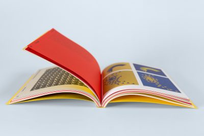
The cover design seizes on the Bauhaus concept of combining art and technology. The laser-cut geometric elements form the typography – understated, yet so refined that the title instantly catches one’s attention. The body adheres to the principle “Form follows function”. Dividers made of the cover material separate the chapters of the magazine. Double gatefolds provide an image overview at the start of each chapter.
Hollow-spine binding
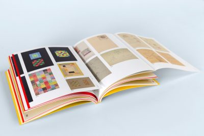
Double gatefolds
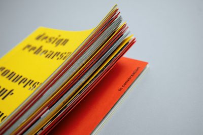
Multiple sorts of paper
- Hollow-back binding
- Laser-cut cover
- Double gatefolds in body
- Various types of paper in body
References

Contact
Write to us and we would be happy to advise you.
Do you have any questions, or would you like to speak directly with a representative?