Paul Ripke
RIPKYTCHENCookbook and travel guide in one
PARI, RIPKYTCHEN, TRIPKY and now TRIPKYTCHEN – Paul Ripke is the founder of his own brands. In addition to clothing, weekly podcasts, sports and travel, cooking and monthly magazines, these brands encompass everything that makes up his life and inspires him. And you can feel that in each of his diverse products, which he breathes life and individuality into with great passion in his adopted home of Newport Beach, California.
RIPKYTCHEN is one of the projects he runs with his wife Theresa. They create and cook recipes that suit their Californian lifestyle and capture this not only in videos, but also in magazines that are produced by us and sent all over the world.
With TRIPKYTCHEN CALIFORNIA, Ripke has now created a cookbook from his RIPKYTCHEN, which is combined with a travel guide. In addition to one hundred recipes, he showcases his favourite places and shares recommendations for hotels, restaurants and bars, running routes (as sport plays a big role in his life) and other highlights. All recipes are available as videos on his website, so nothing stands in the way of cooking together.
Hardcover with special colour printing and hot foil embossing
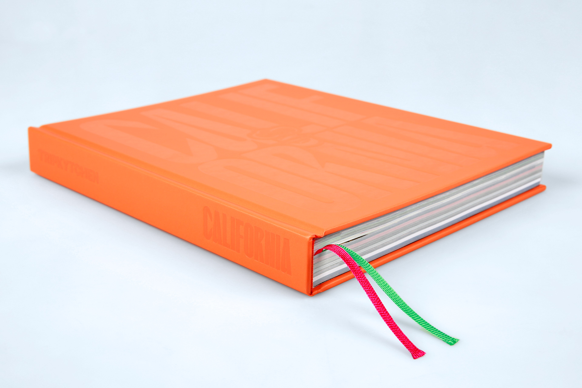
Hot foil embossing on U1 and spine, plus high-contrast ribbons
Silky surface thanks to matt, scratch-resistant film lamination
Perfect serving behaviour thanks to box spine
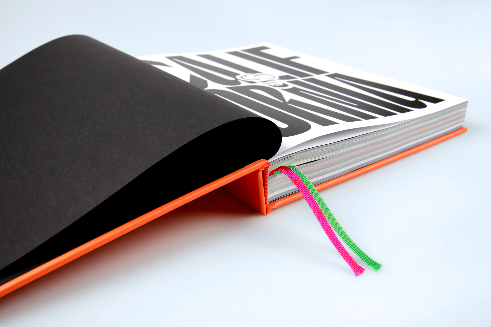
Dyed-through endpapers in deep black, colour-coordinated capital band
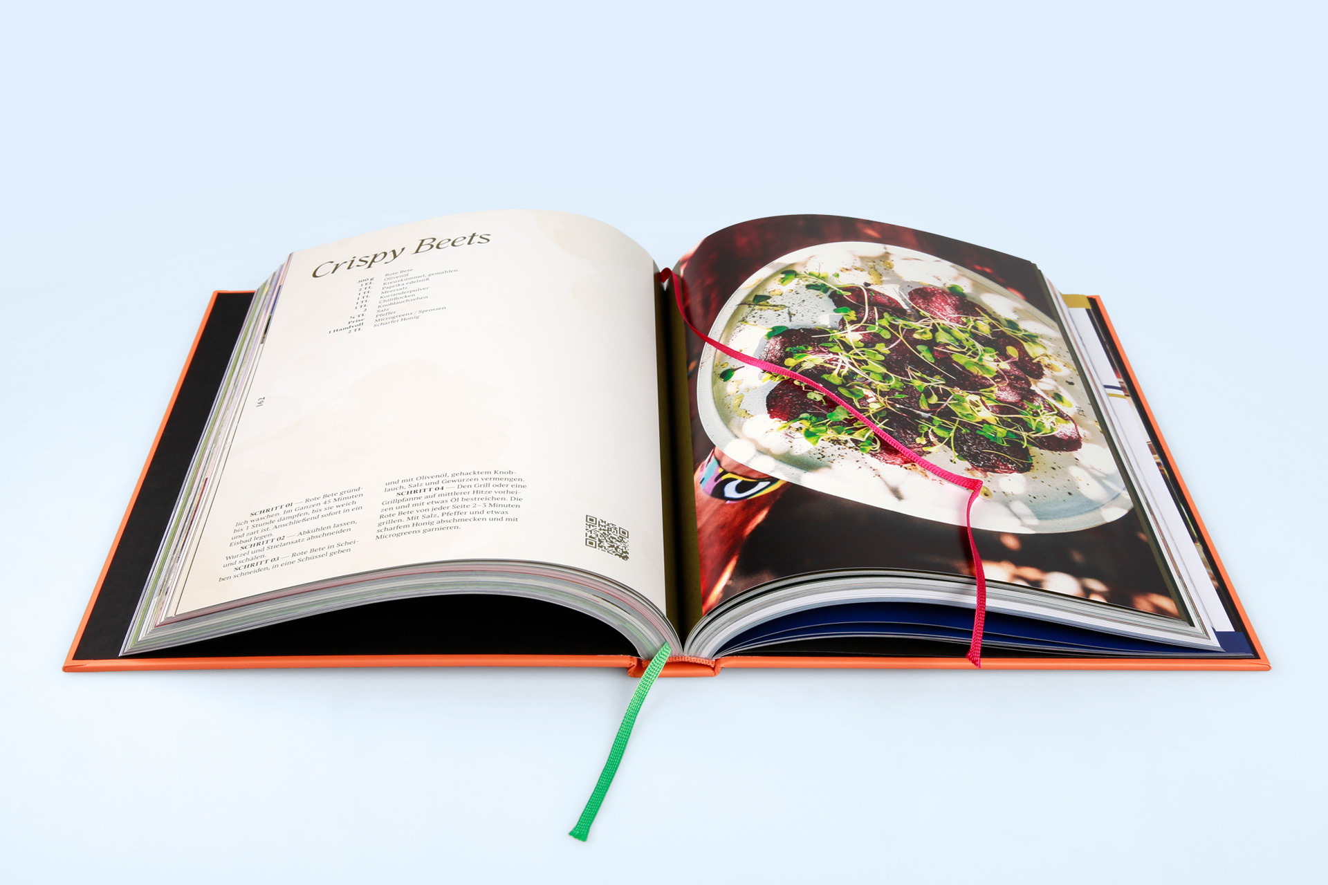
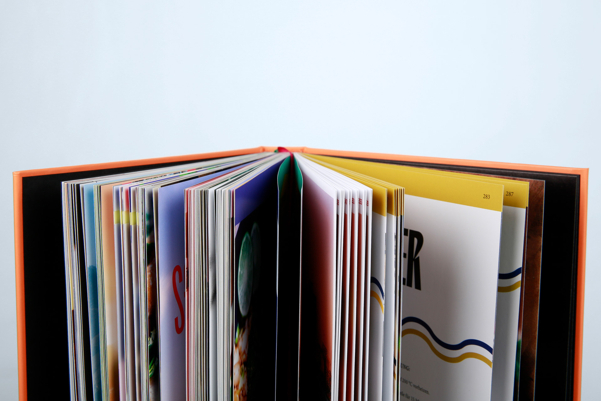
Colour-intensive printing on content pages
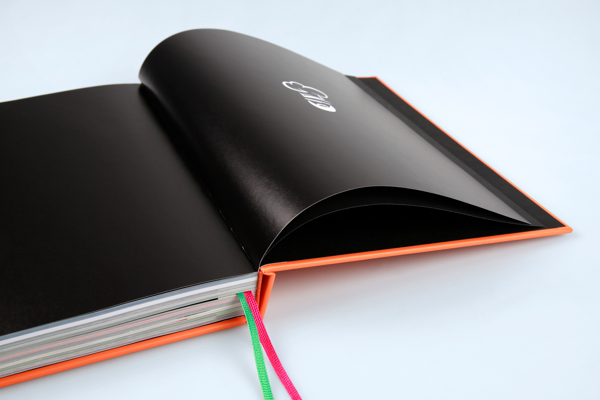
Perfect printing of deep black to match the endpapers
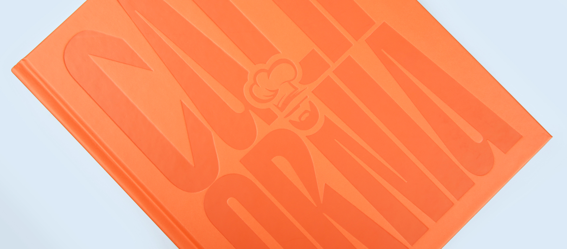
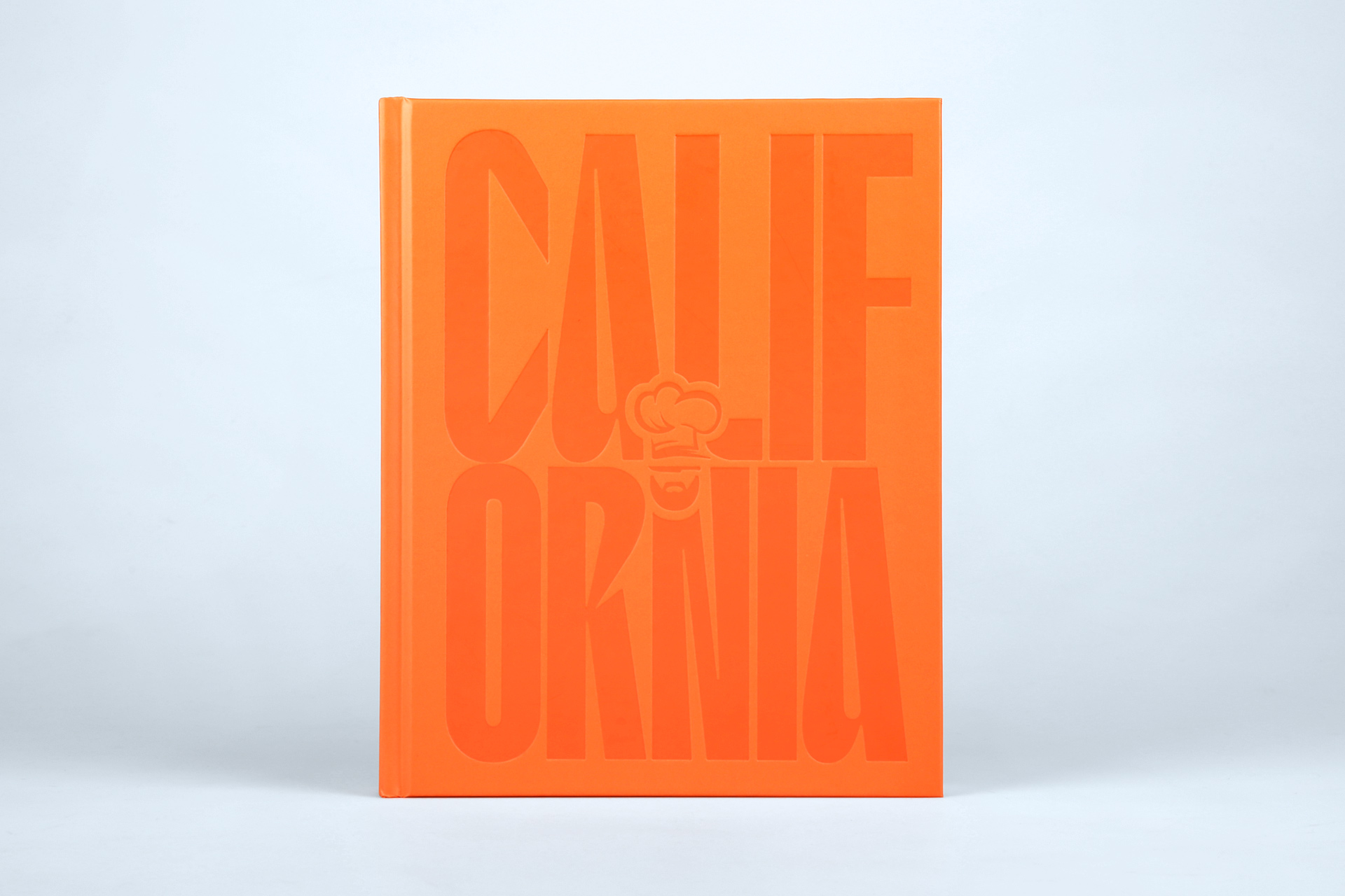
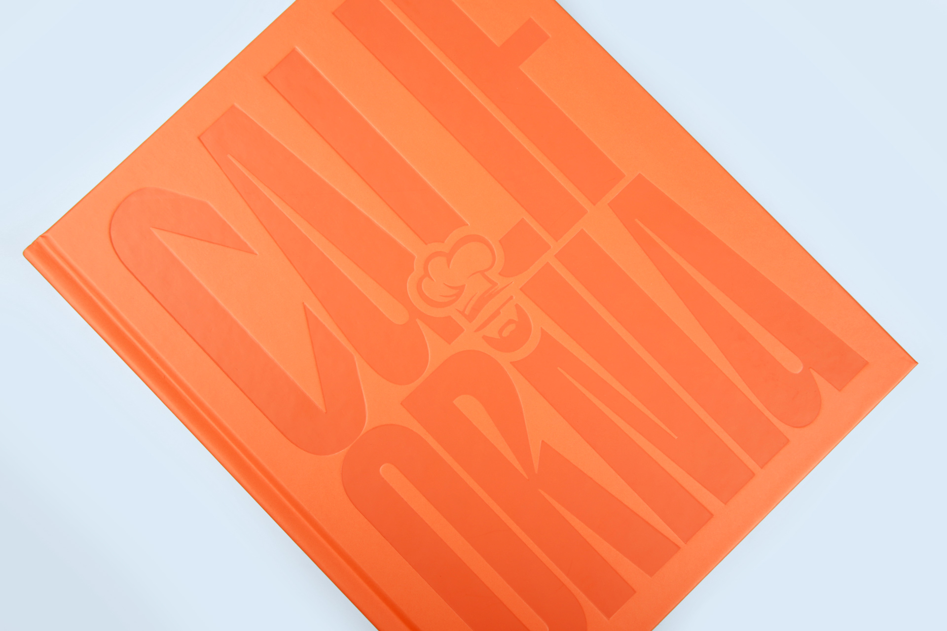
The fact that TRIPKYTCHEN is a work by Paul Ripke is immediately apparent from the hardcover. The cookbook shines in bright orange and features his likeness once in small print integrated into the typography on the title page and again filling the entire back cover.
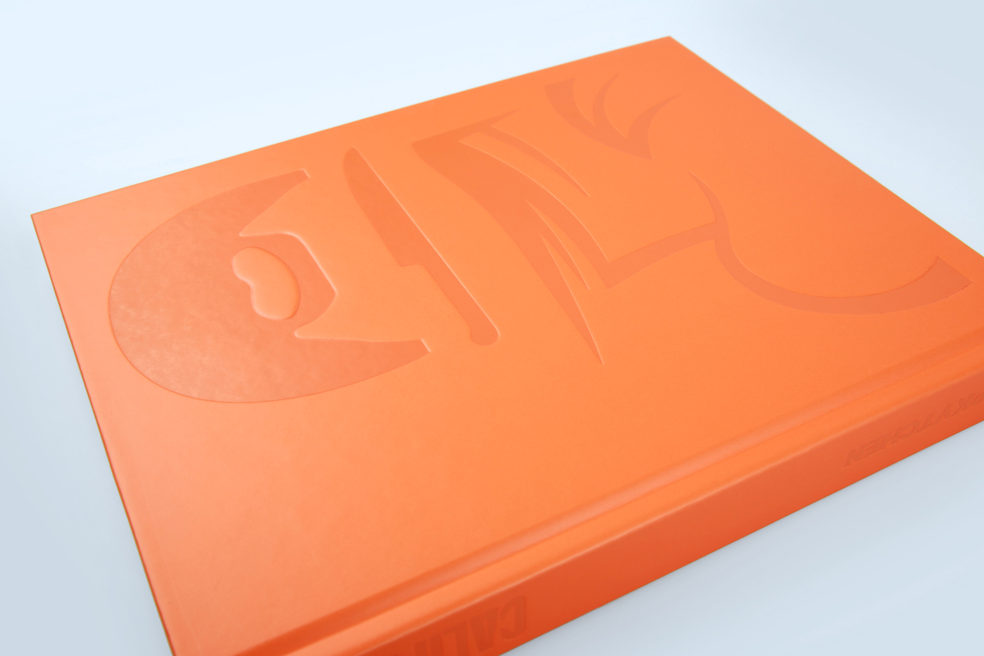
The cover was printed in a single colour using a Pantone special colour orange and laminated with a matt, scratch-resistant film, giving the book a special velvety feel. In addition, the cover was partially embossed with orange hot foil in the areas of the lettering and graphics. The embossing enhances the title, spine and U4 of the hardcover. The orange of the hot foil contrasts subtly with the tone of the cover and gives the product a modern touch.
Take a closer look at the cover
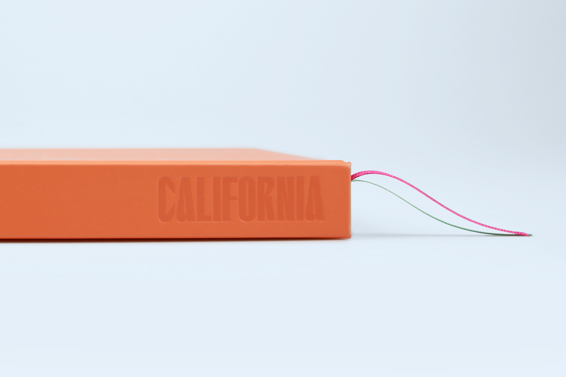
A orange capital band was chosen to match the Pantone value of the cover. The cookbook is completed by two ribbons in pink and green, which contrast strikingly with the cover.
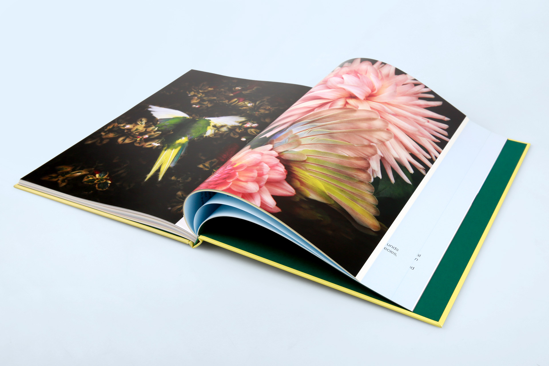
The inside of the hardcover mirrors Ripke’s website: the categories are brightly coloured, with explanations in rich black. A deep black, dyed coated paper was chosen for the endpapers, and the brilliant print on the 296 pages of content also features strong colours and sharp contrasts.
- Hardcover with box spine
- Book cover with special colour printing
- Hot foil stamping in orange on U1, spine and U4
- Matt and scratch-resistant film lamination
- Dyed-through endpapers in deep black
- Two ribbons in pink and green
Further print references
Do you have any questions, or would you like to speak directly with a representative?